↓
Client
Vurge
Type
Project
Industry
Energy
About the Brand
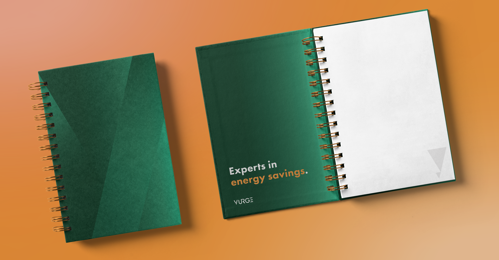
Vurge, formerly Managed Energy Systems, needed a jolt of fresh ideas. With renaming came a new brand utilizing form, function and design. This brand communicates creativity, reliability and cohesion by utilizing two main color families of orange and green. Every department, specialty, product or service offered within the Vurge portfolio is represented with these combinations of the palette through gradients, using emphasis in color to help identify arms of the company
vurgeco.com
Deliverables
BRAND NAMING AND DEFINITION
BRAND POSITIONING AND MESSAGING FRAMEWORK
VISUAL IDENTITY DEVELOPMENT
WEBSITE ARCHITECTURE AND UX/UI DESIGN
PACKAGING AND PRINTING COLLATERAL
WEBSITE DEVELOPMENT AND LAUNCH


